33 Life expectancy in America explained in 1 simple image (media.kotakuinaction2.win) posted 3 years ago by dekachin 3 years ago by dekachin +33 / -0 43 comments download share 43 comments share download save hide report block hide replies
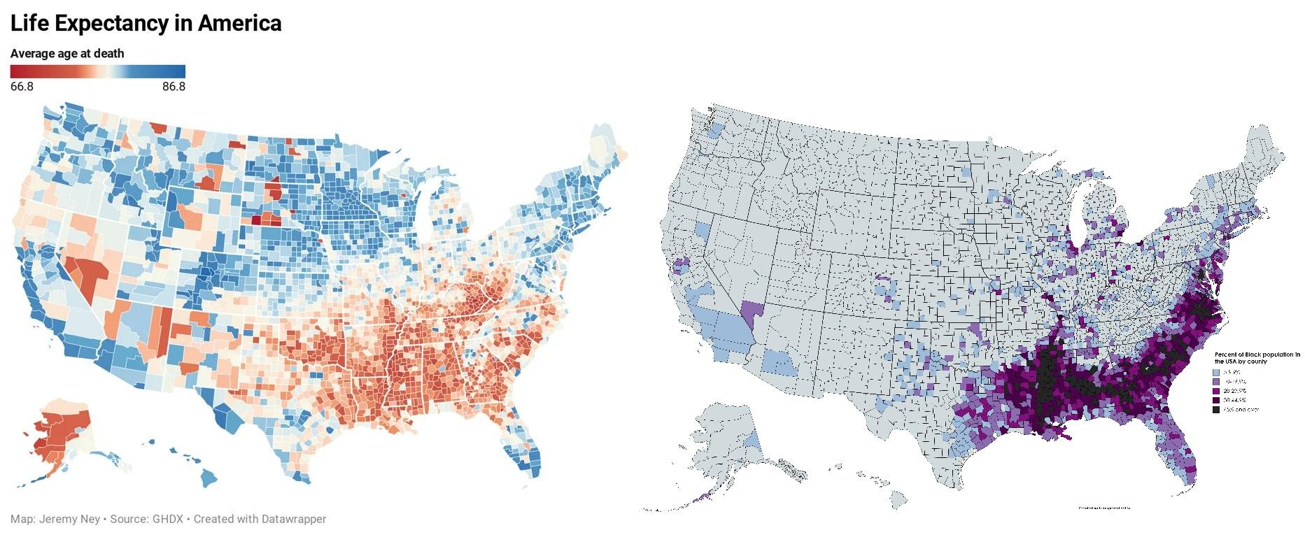
I'd guess that the native american population density map also correlates to lower life expectancy map.
Eastern Oklahoma and parts of New Mexico, Arizona and Montana on the map match native american populations perfectly.