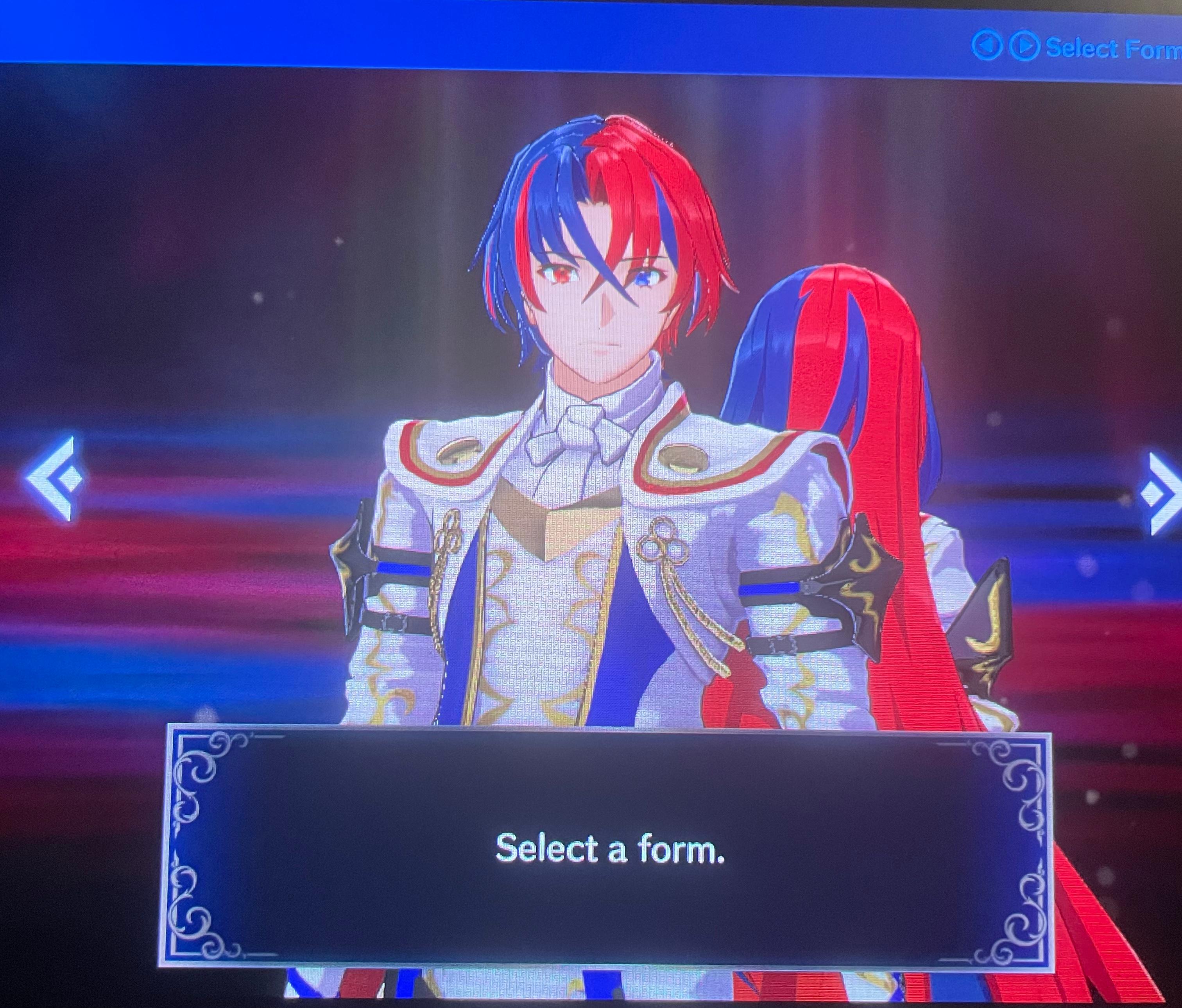
29 Select A Form, Better or Worse than Type 1 and Type 2? (media.communities.win) posted 1 year ago by Ahaus667 1 year ago by Ahaus667 +29 / -0 24 comments download share 24 comments share download save hide report block hide replies

The contrast between the oversaturated red and blue is really hard to look at. I don't know what this is but I'm not interested in buying it based on the design alone. There's no way the rest of it won't suffer from this same shitty aesthetic.